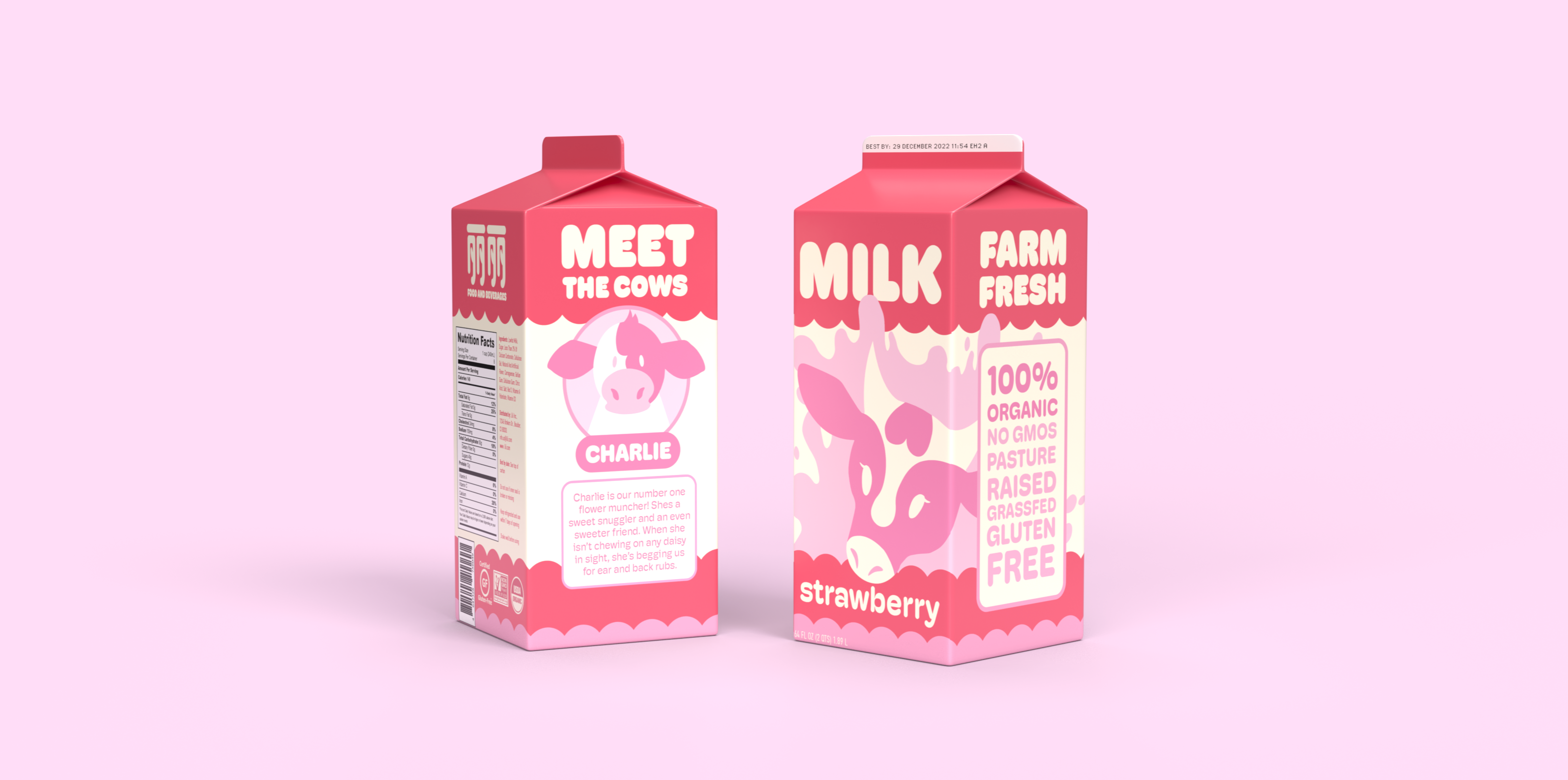
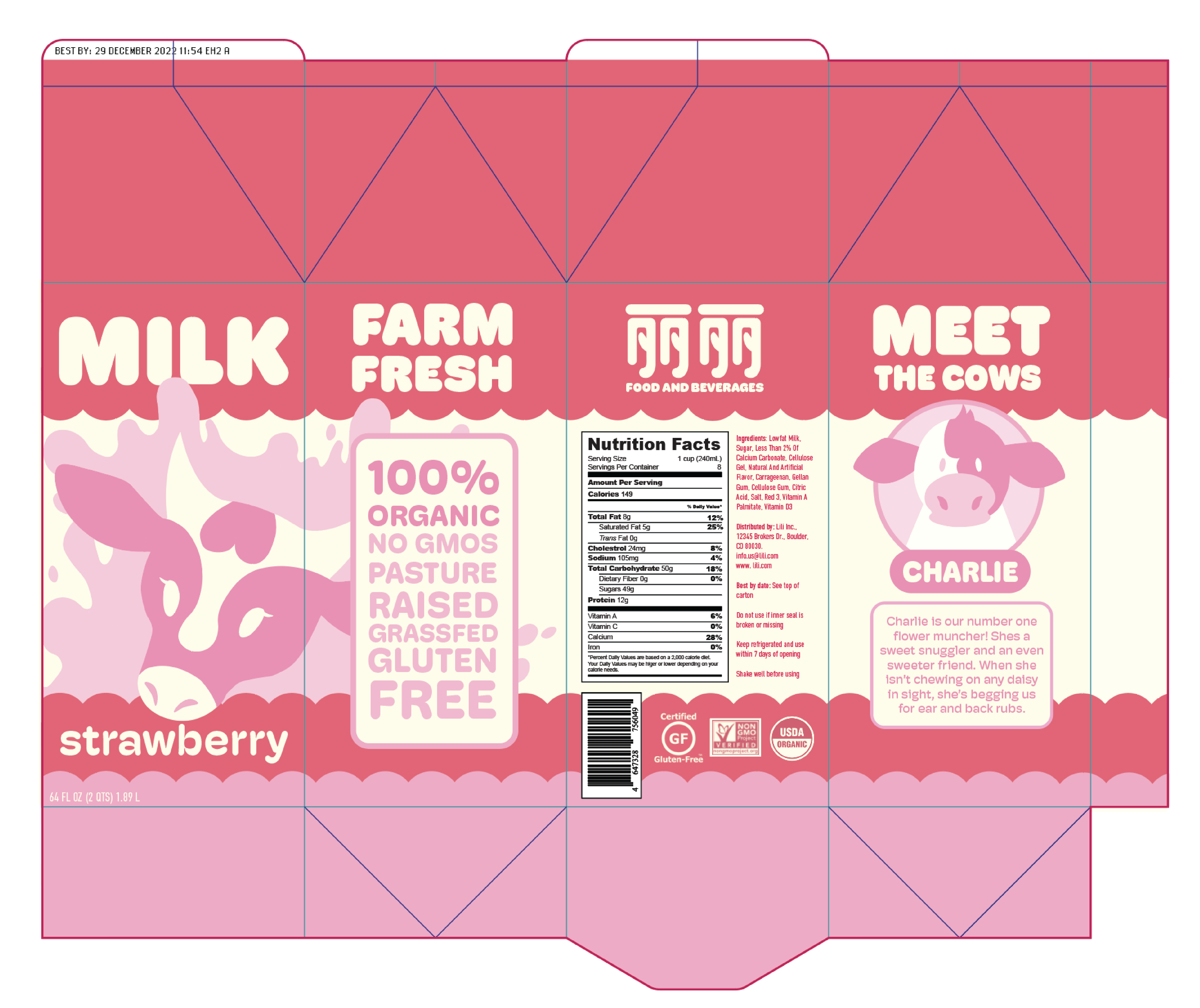
Lili's Strawberry Milk is a concept for a milk line based on my own personal brand. I was challenged to capture the essence of my branding while creating appealing, communicative packaging.
Lili's Strawberry Milk calls upon cute aesthetics to provide a personal consumer experience. Bubbly fun and gentle typography and graphics are paired with soft, muted colors to represent a empathetic approach to cows.

Primary Typeface

Secondary Typeface
Fonts were selected to maintain the soft, rounded feel of the brand. The majority of the text uses varying weights of Hoss Round, while DIN Condensed is used to communicate key information on the back of the packaging.
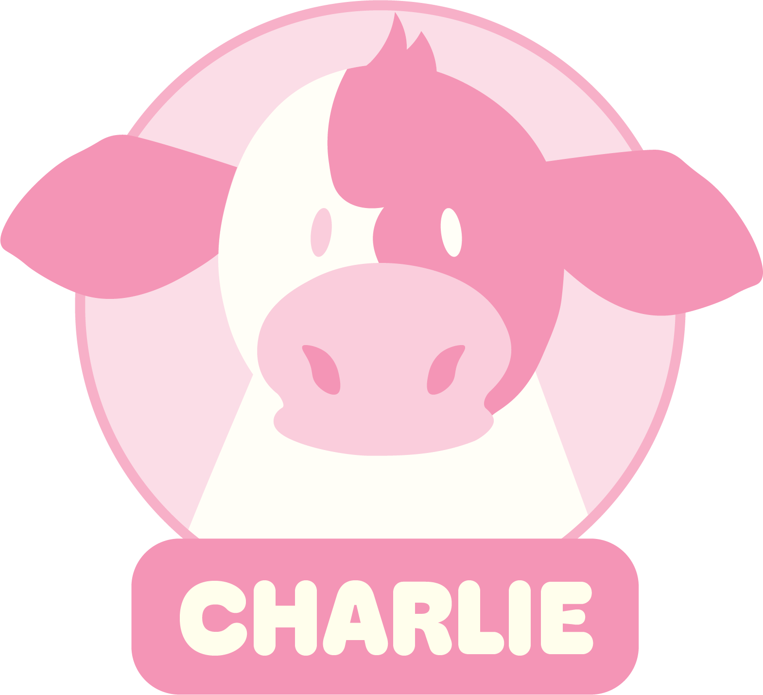
Mascot characters are centered in packaging design to appeal to younger consumers. Lili's Strawberry Milk calls upon recent trends in "cutecore" packaging to drive consumer engagement.
Individual cow profiles were added to make the milk itself feel more personal. Consumers are able to feel good about drinking Lili's Strawberry Milk through connecting with the cows individual personalities and stories.
Further expansion of the line would see the design of additional cows, and color scheme changes for different brands of milk.
Lili's Strawberry Milk utilized skills in marketing and branding, and combined them with illustrative design skills. The process of taking flat 2d mockups into the 3d realm was essential for this project. Designing for 3d space was a key element.